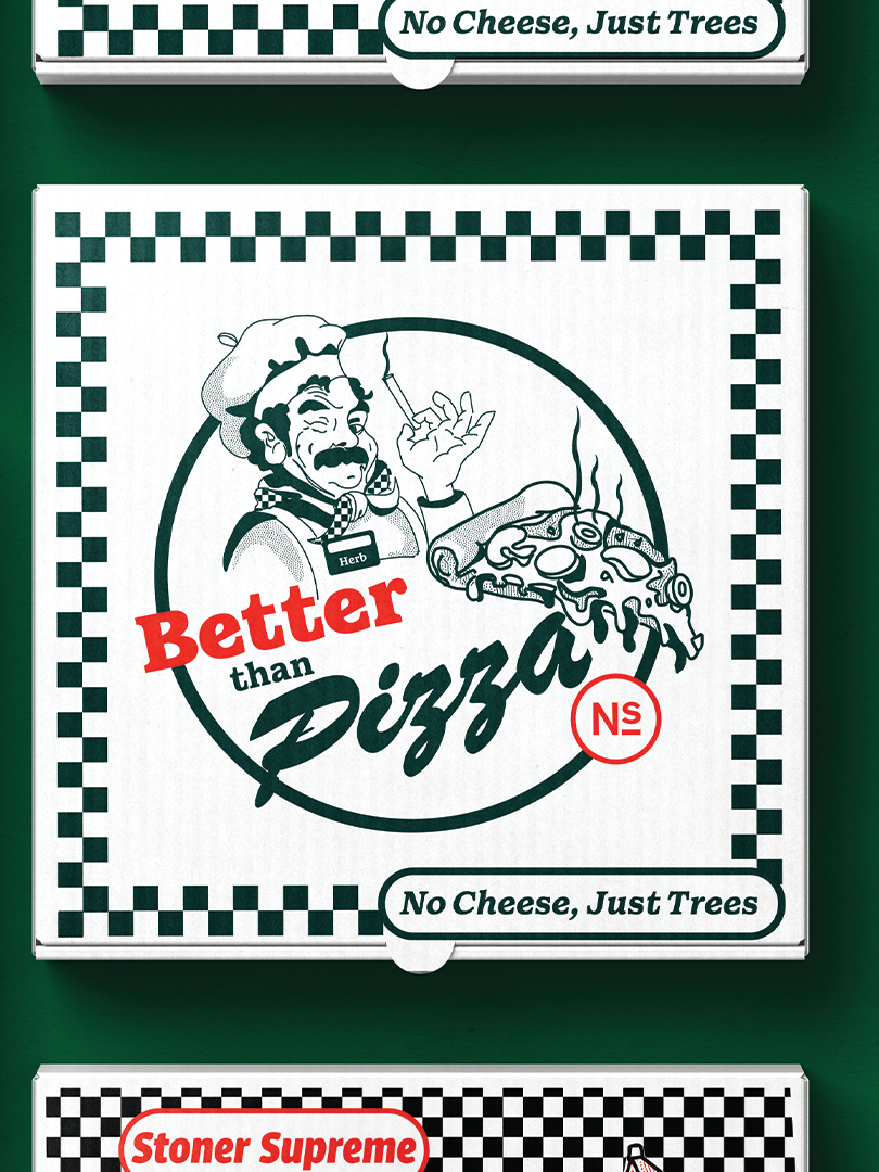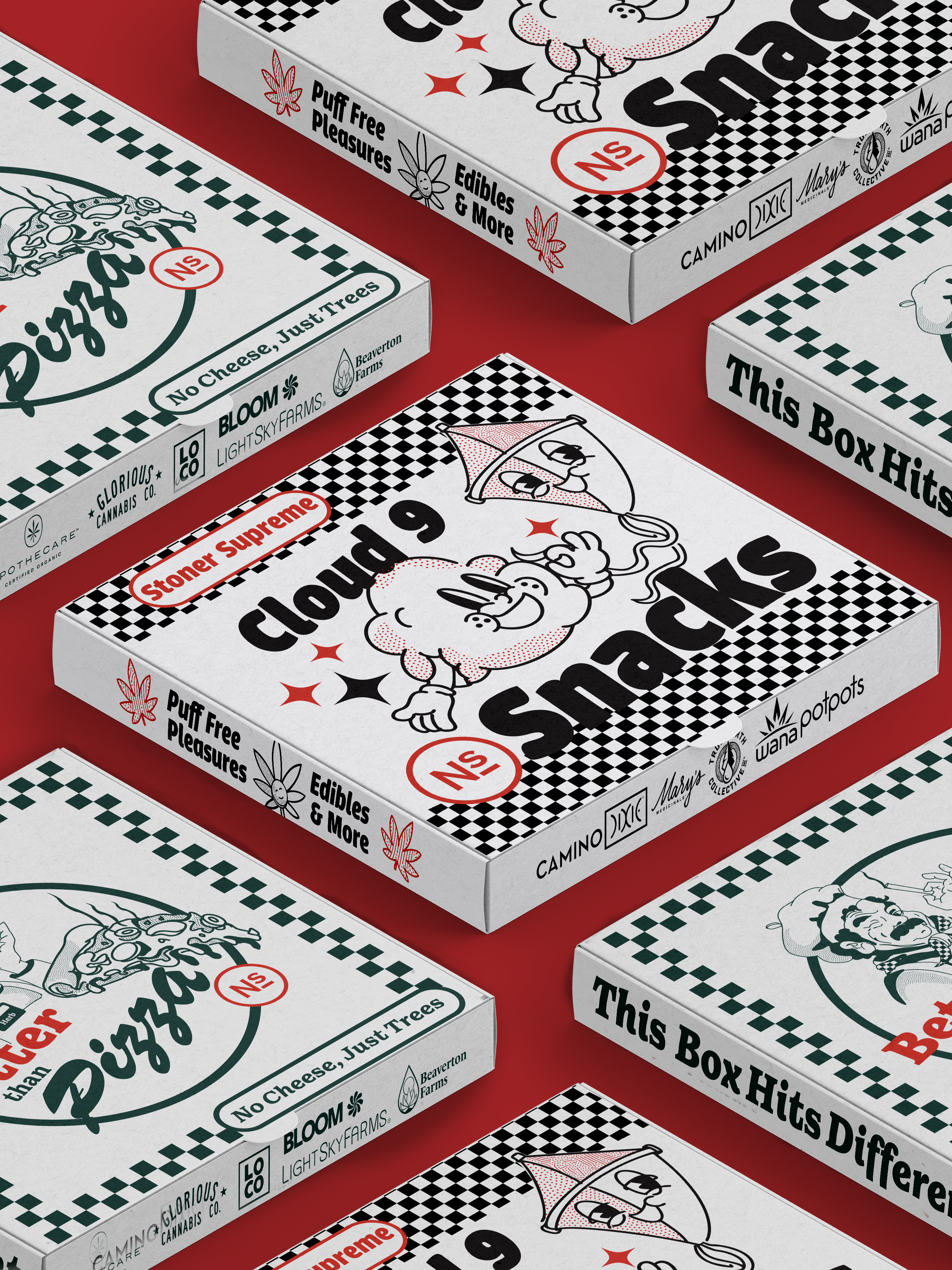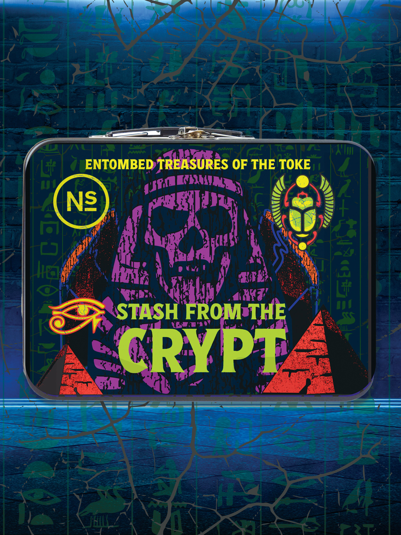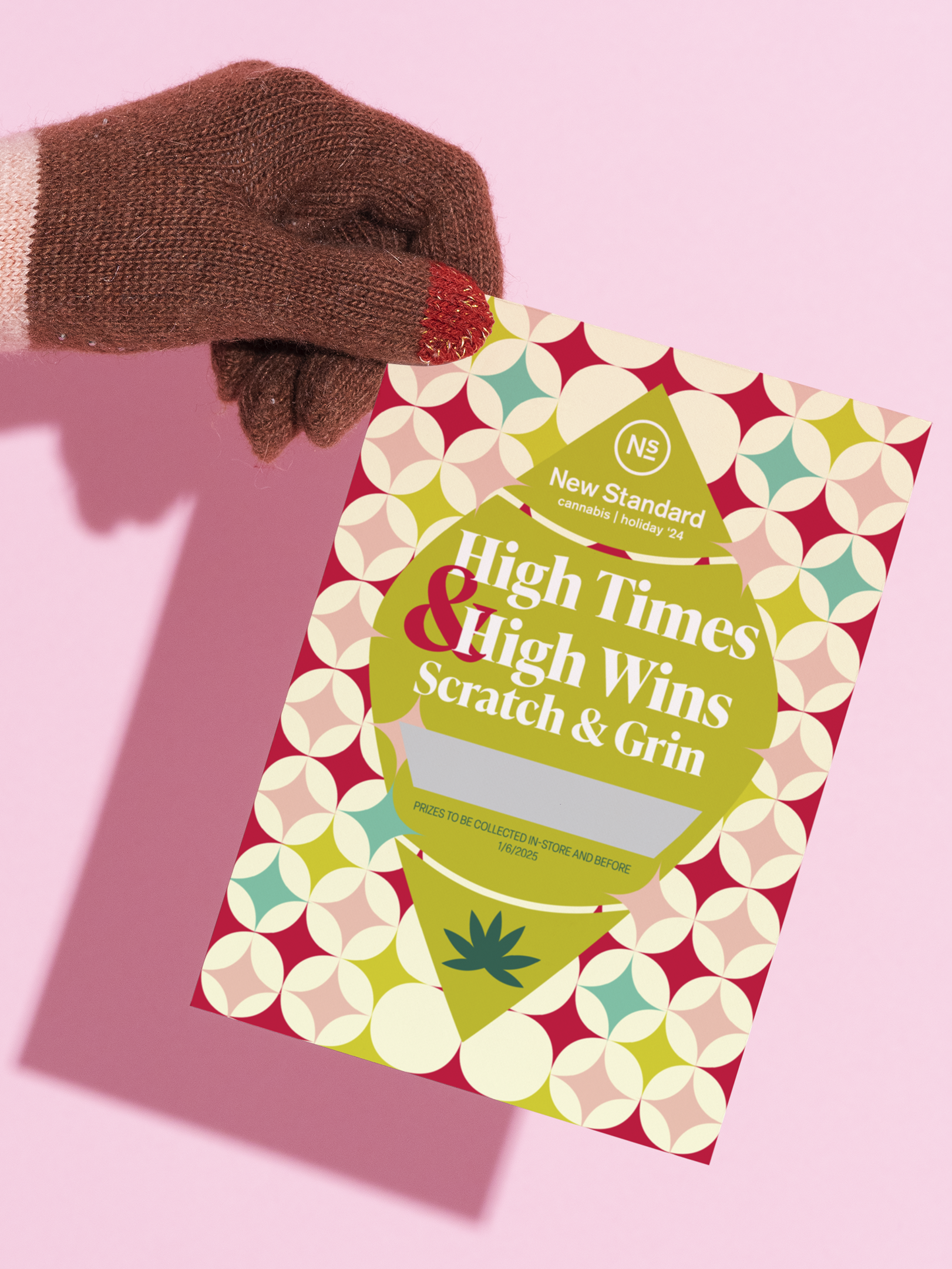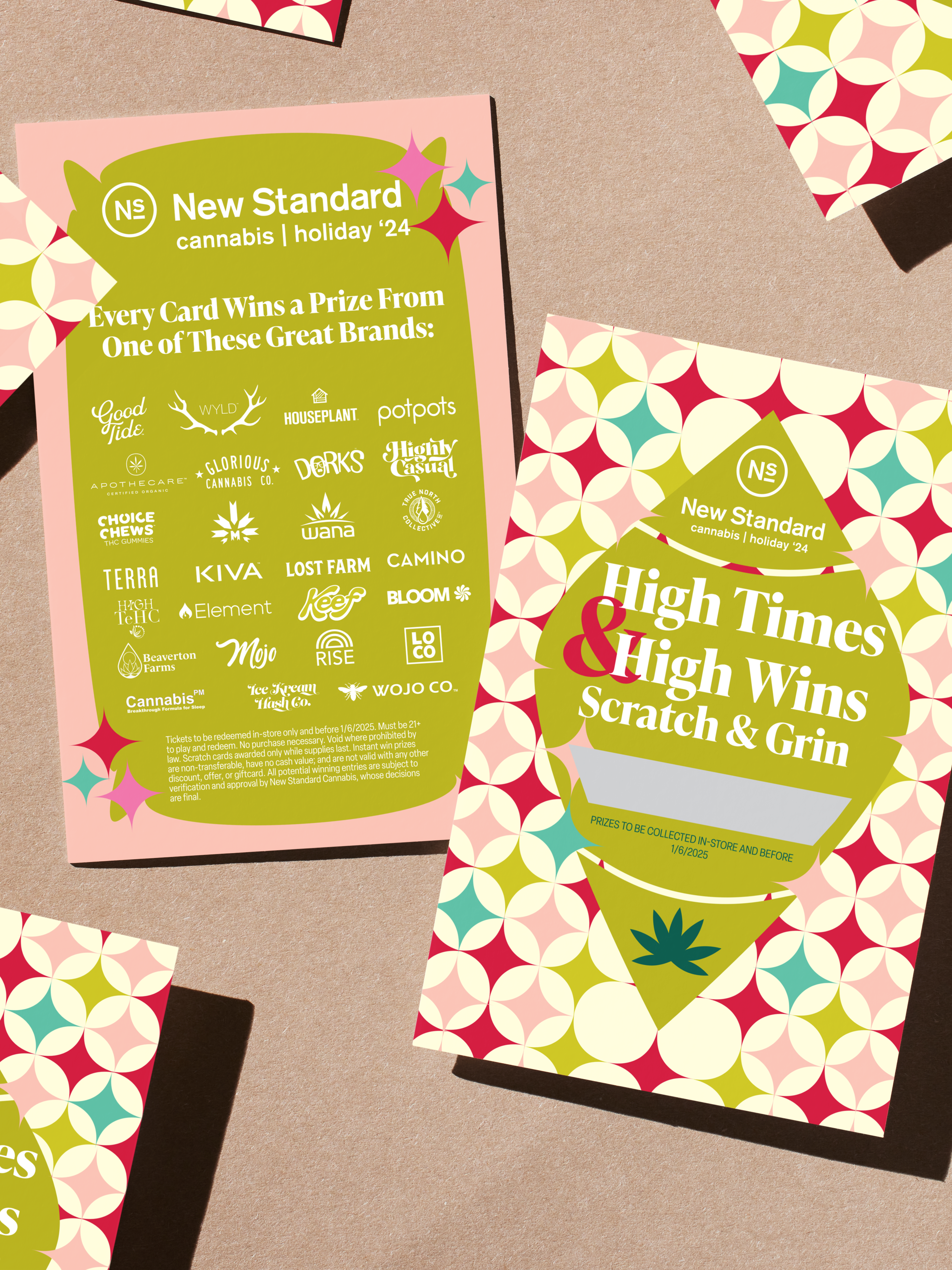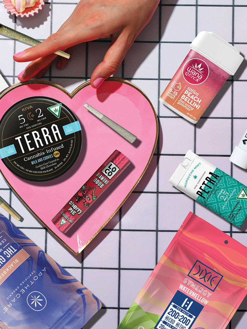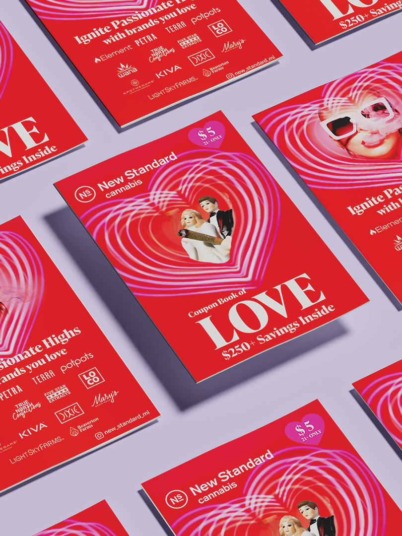
Complete brand identity for a cannabis launch entering a crowded, visually noisy market. Built from zero — no existing logo, no visual language, no product differentiation.
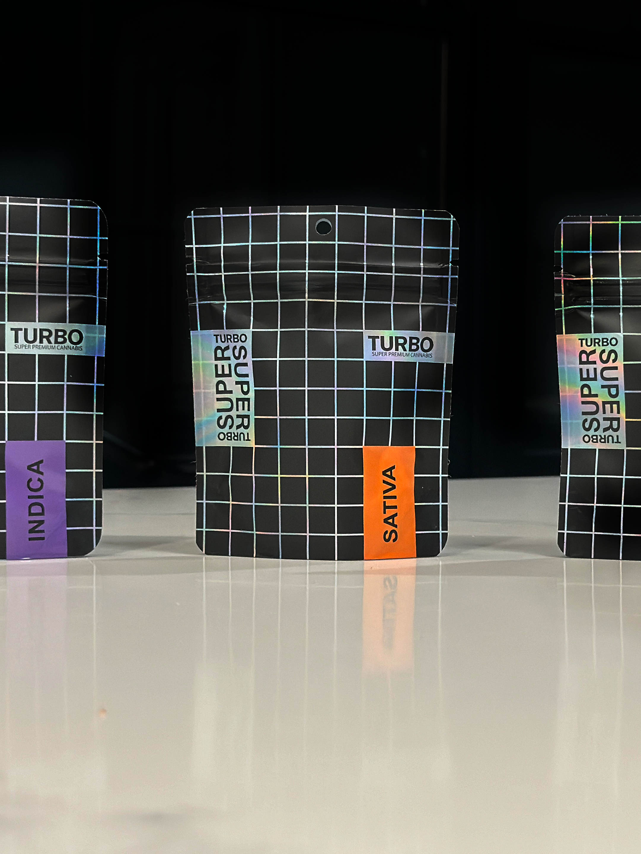
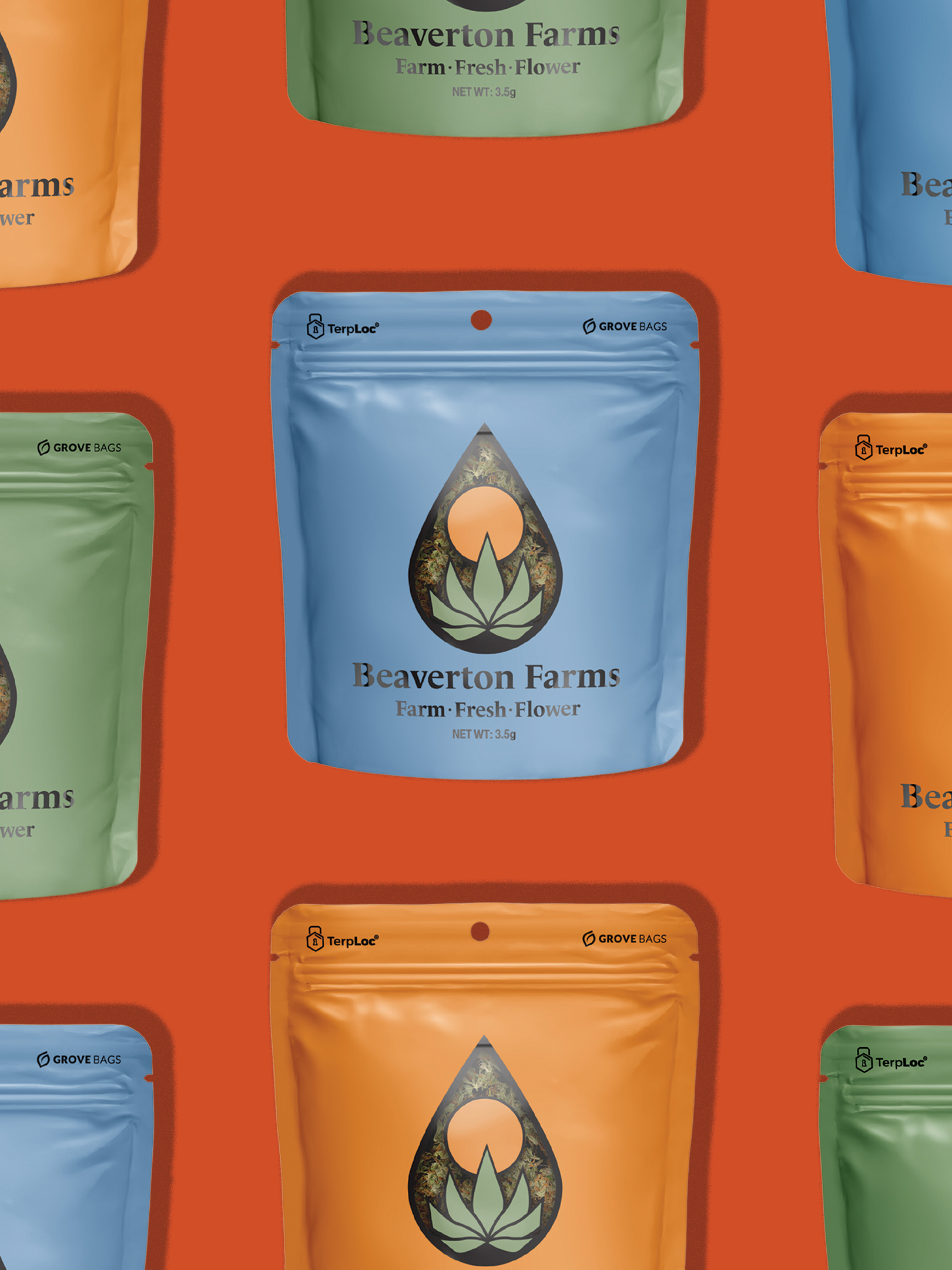
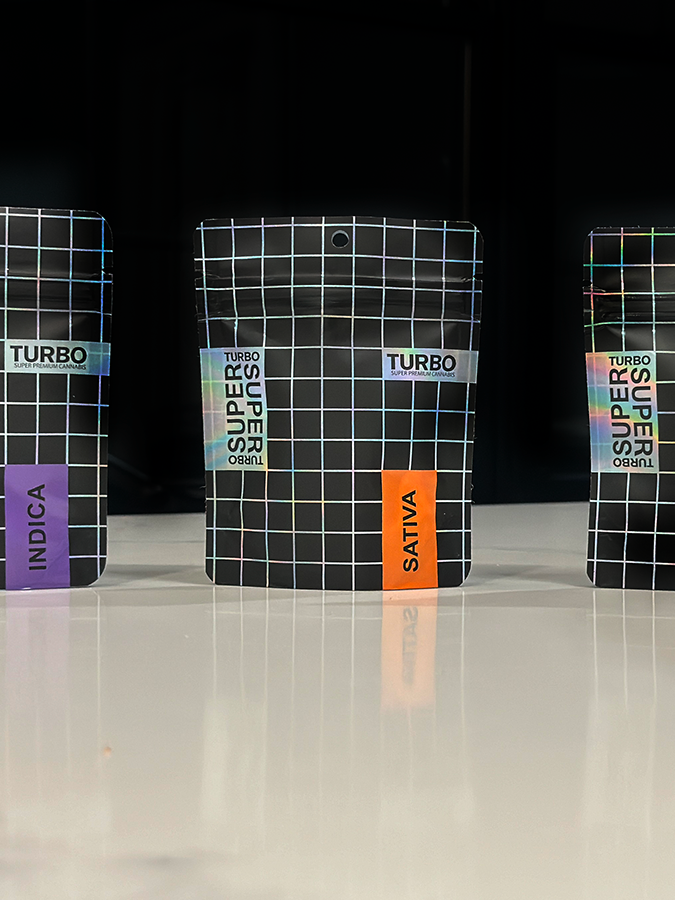
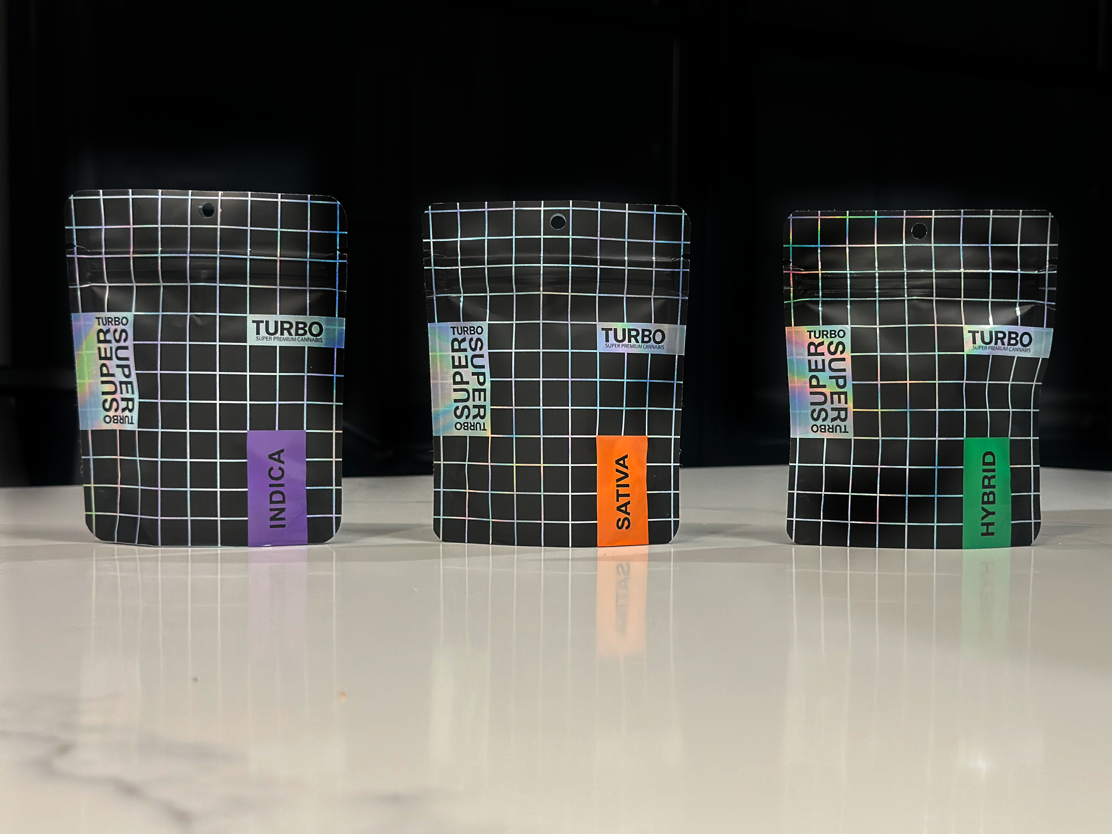
The system was built around a bold, high-energy personality: grid-based structure, holographic accents, and intuitive color coding that allowed consumers to navigate across SKUs quickly at shelf. Every decision balanced visual confidence with functional clarity.
From brief to shelf-ready in weeks.
Role: Brand Strategy · Logo Design · Visual Identity · Packaging Design · Color System · Creative Direction