Beaverton Farms was entering a saturated Michigan cannabis market without an existing identity. They needed a complete brand foundation — logo, messaging, packaging, and visual system — that would position them as a farm-first, quality-driven alternative to louder, more aggressive competitors on the shelf.
Brand Strategy
The system was built around approachability and clarity. Where most cannabis brands push hype, Beaverton Farms would push honesty — farm first, transparent, and dependable. Every design decision reinforced that positioning.
Identity & Messaging
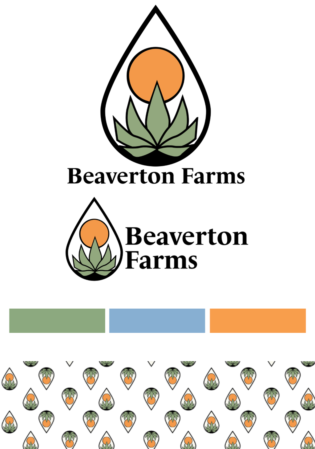
•Logo built around natural growth and cultivation symbolism. Immediately readable, organically rooted
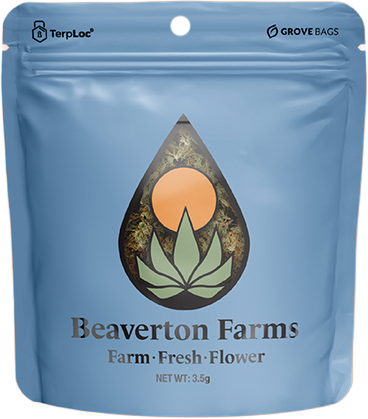
• Warm, grounded color palette inspired by land, water, and harvest: sage, sky blue, and amber
•Brand voice centered on honesty, education, and accessibility. No jargon, No posturing

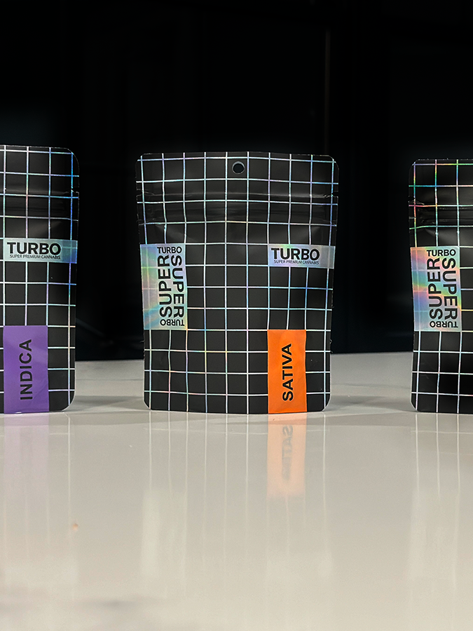
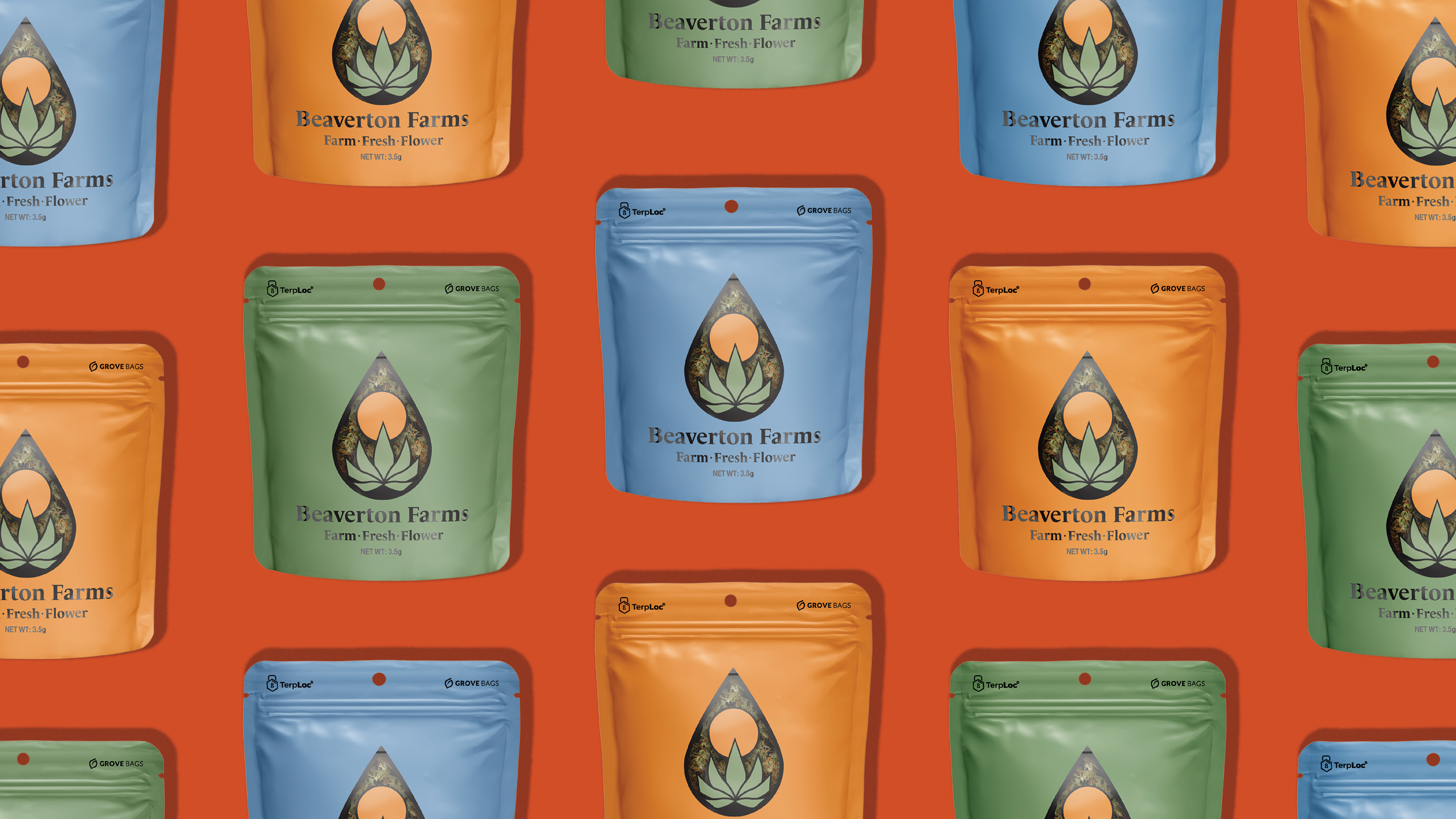
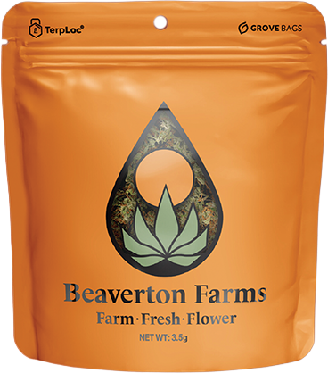
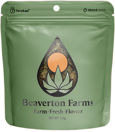
Packaging System
•Eco-conscious materials with a clean, minimal design approach
•Element-based strain categorization for intuitive consumer navigation at shelf.
• Consistent visual language scaled across all SKUs and touch points.
Impact
A cohesive, scalable brand foundation that established Beaverton Farms as a recognizable Michigan cannabis brand. Distinctive, approachable, and built to grow.
Creative Direction · Brand Strategy · Logo Design · Packaging Design