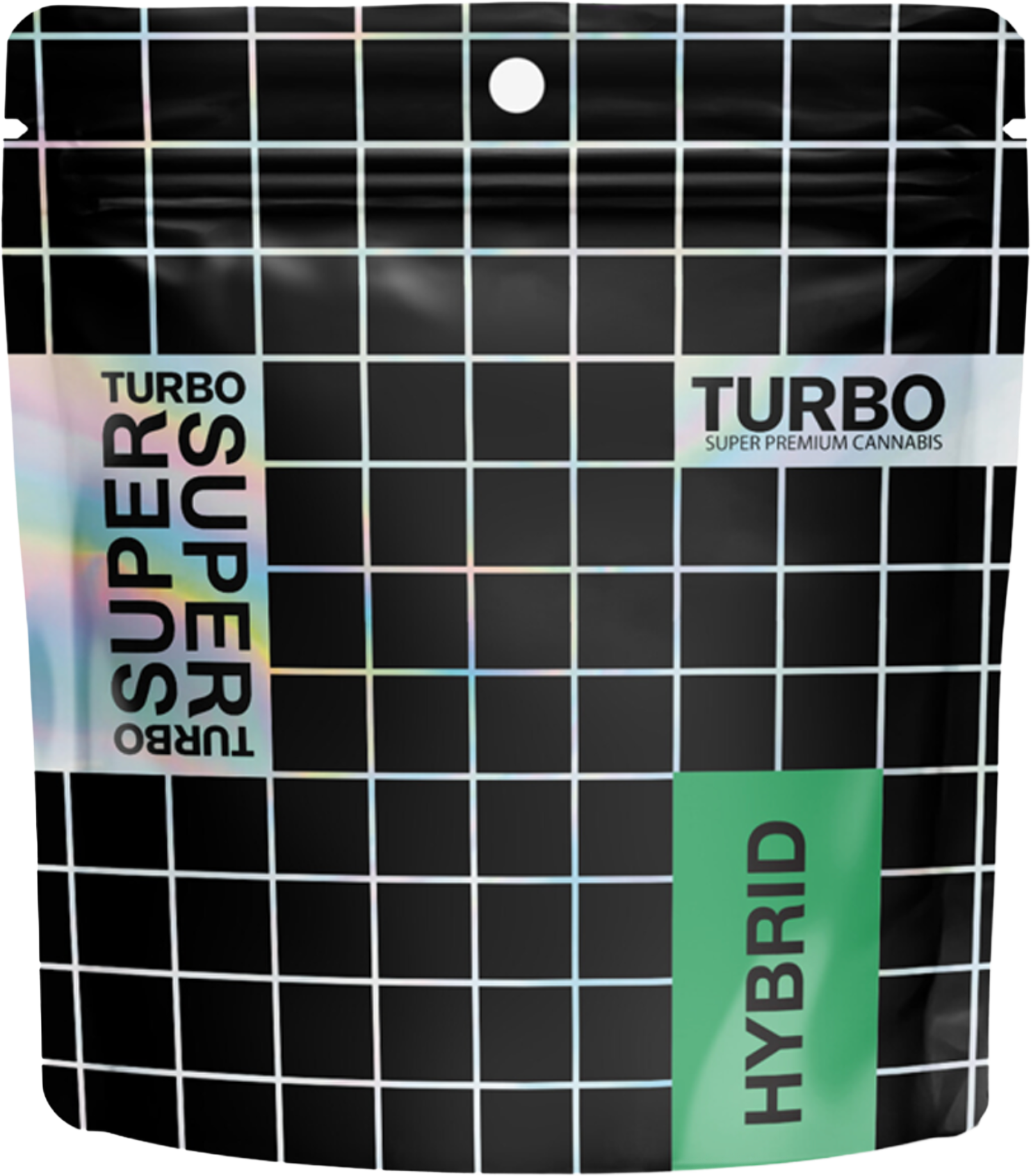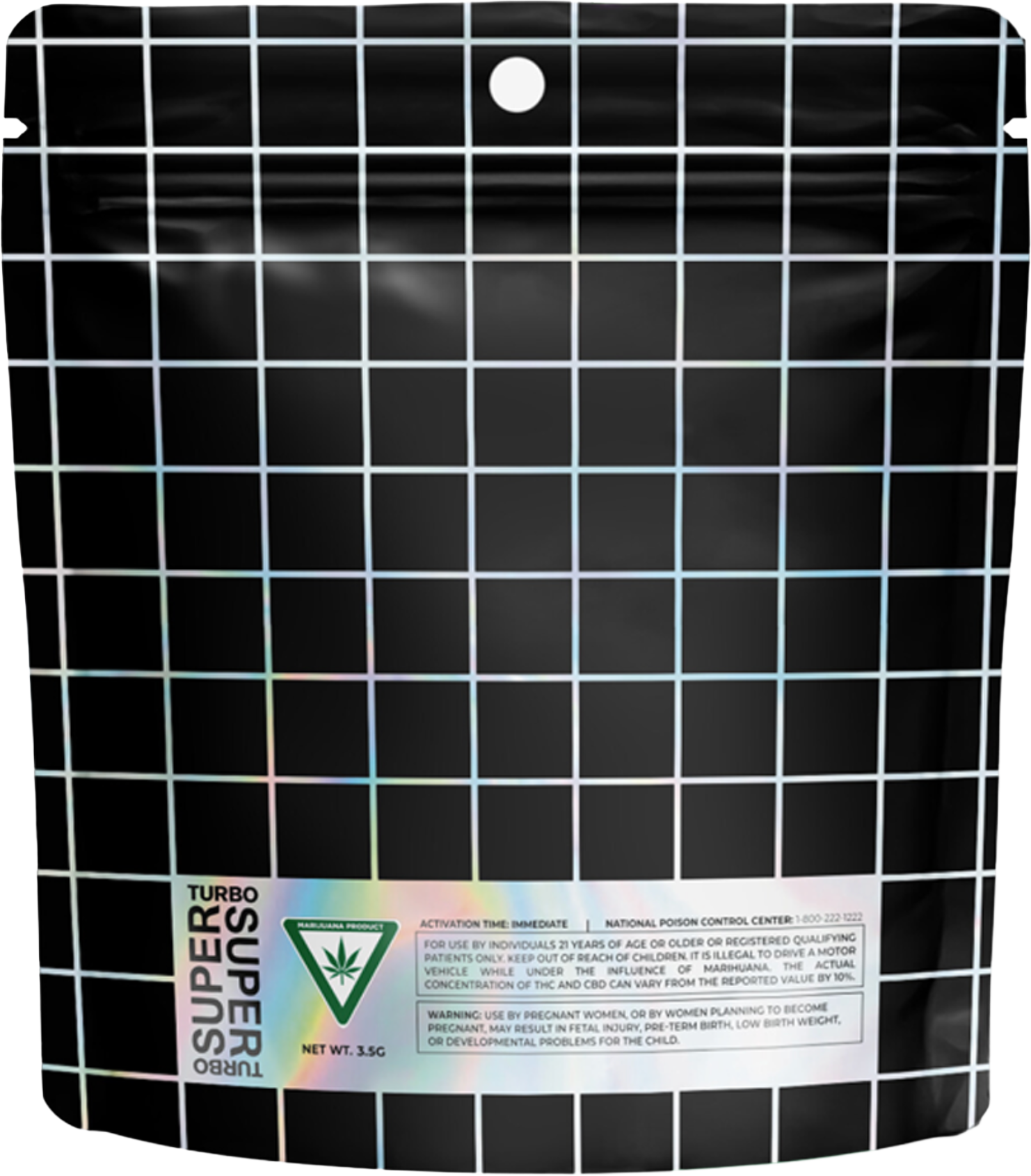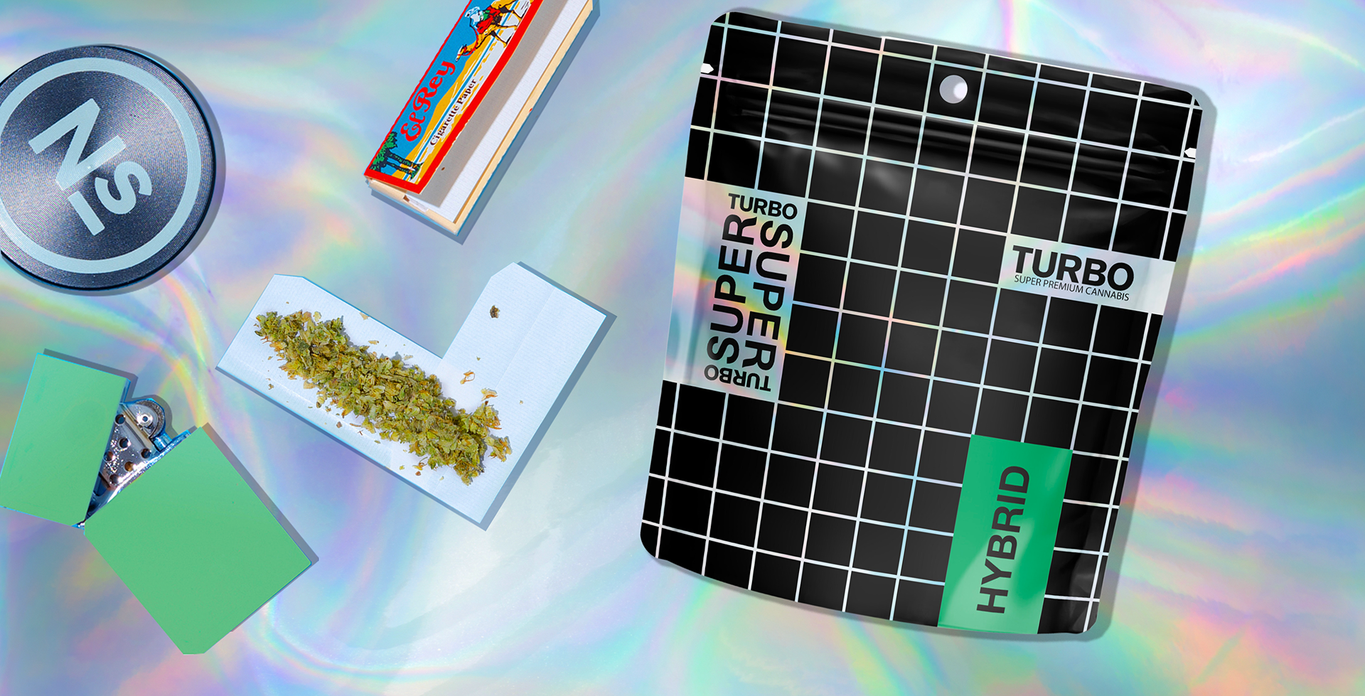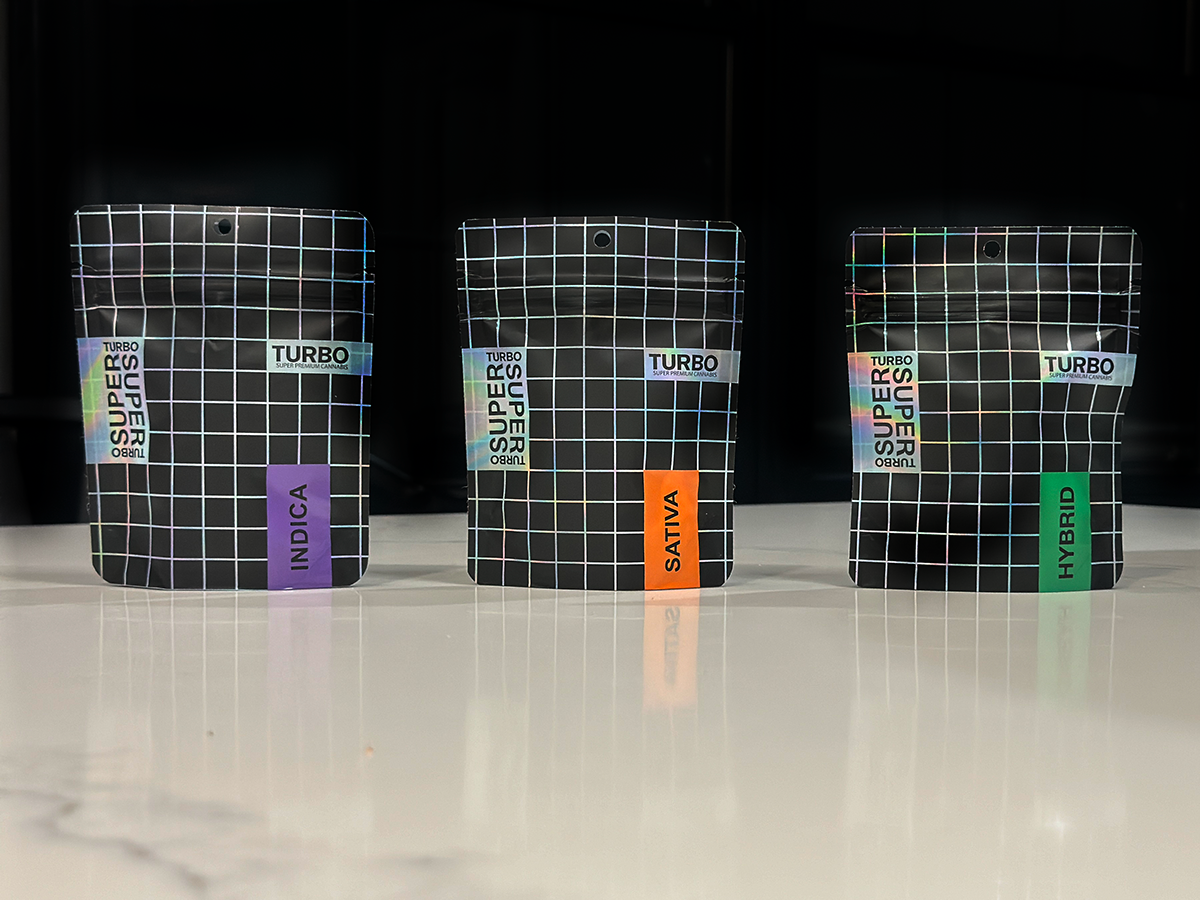
SUPER SUPER TURBO was built as a brand from zero—designed to stand out in a saturated cannabis market through clarity, energy, and futuristic restraint.
Strategic Approach
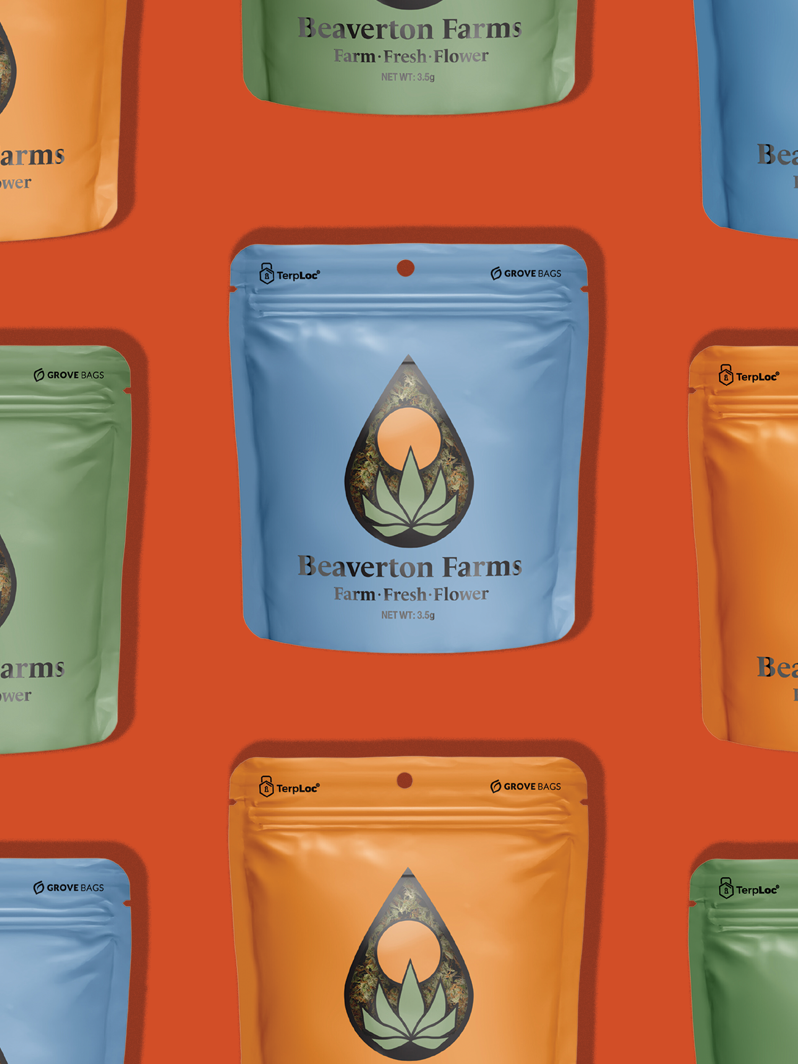
The identity balances high-impact visuals with intuitive product navigation, allowing consumers to understand strain type instantly while reinforcing a bold, premium attitude.
The identity balances high-impact visuals with intuitive product navigation, allowing consumers to understand strain type instantly while reinforcing a bold, premium attitude.
Brand Systems
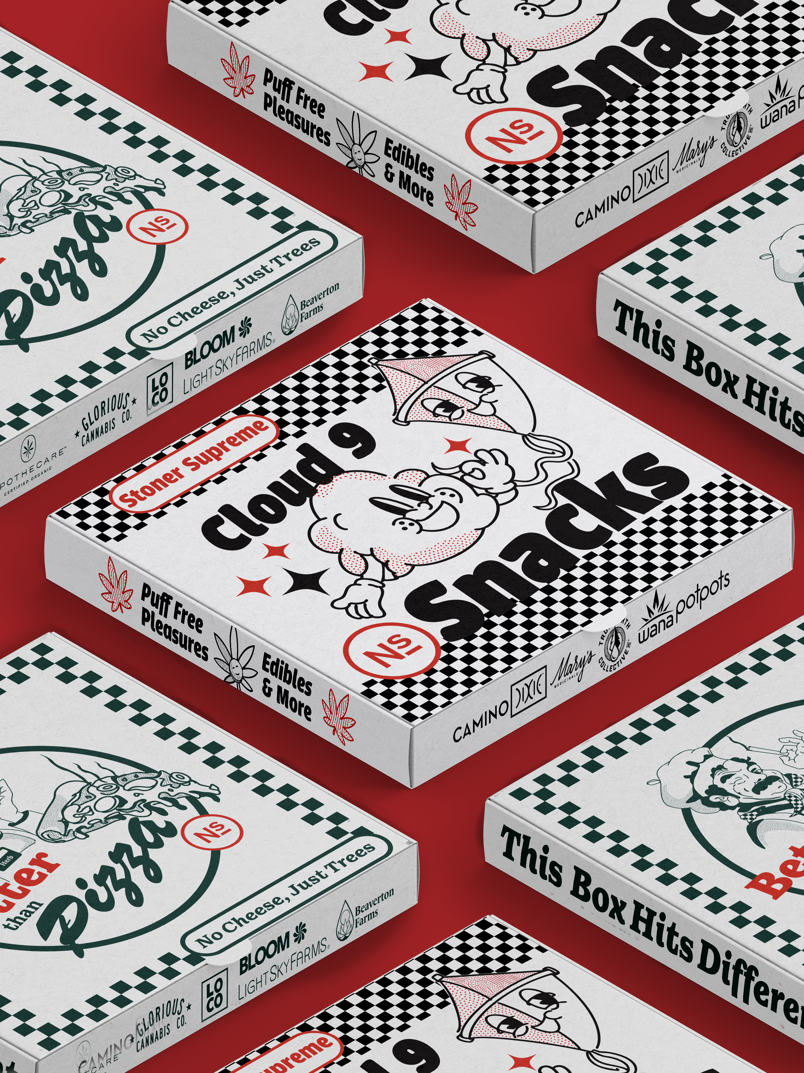
• Distinct visual grid system for instant shelf recognition
• Color-coded strain architecture (Indica, Sativa, Hybrid)
• Minimal typography paired with holographic accents
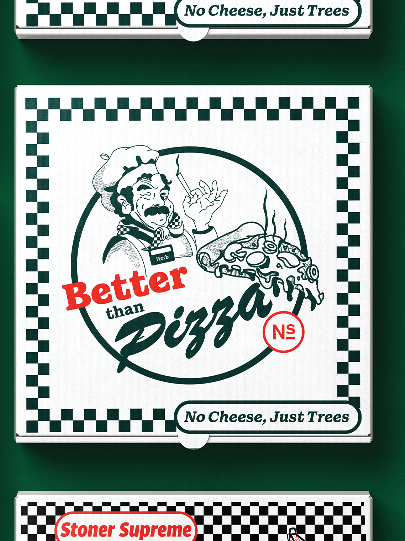
Packaging Design
• Matte black base for premium contrast
• Iridescent grid overlays for depth and motion
• Scalable system adaptable across SKUs
Outcome
• Clear product differentiation at shelf
• Strong brand recall through a consistent visual system
• Flexible foundation for future product expansion
Role
Brand Strategy · Visual Identity · Packaging Design