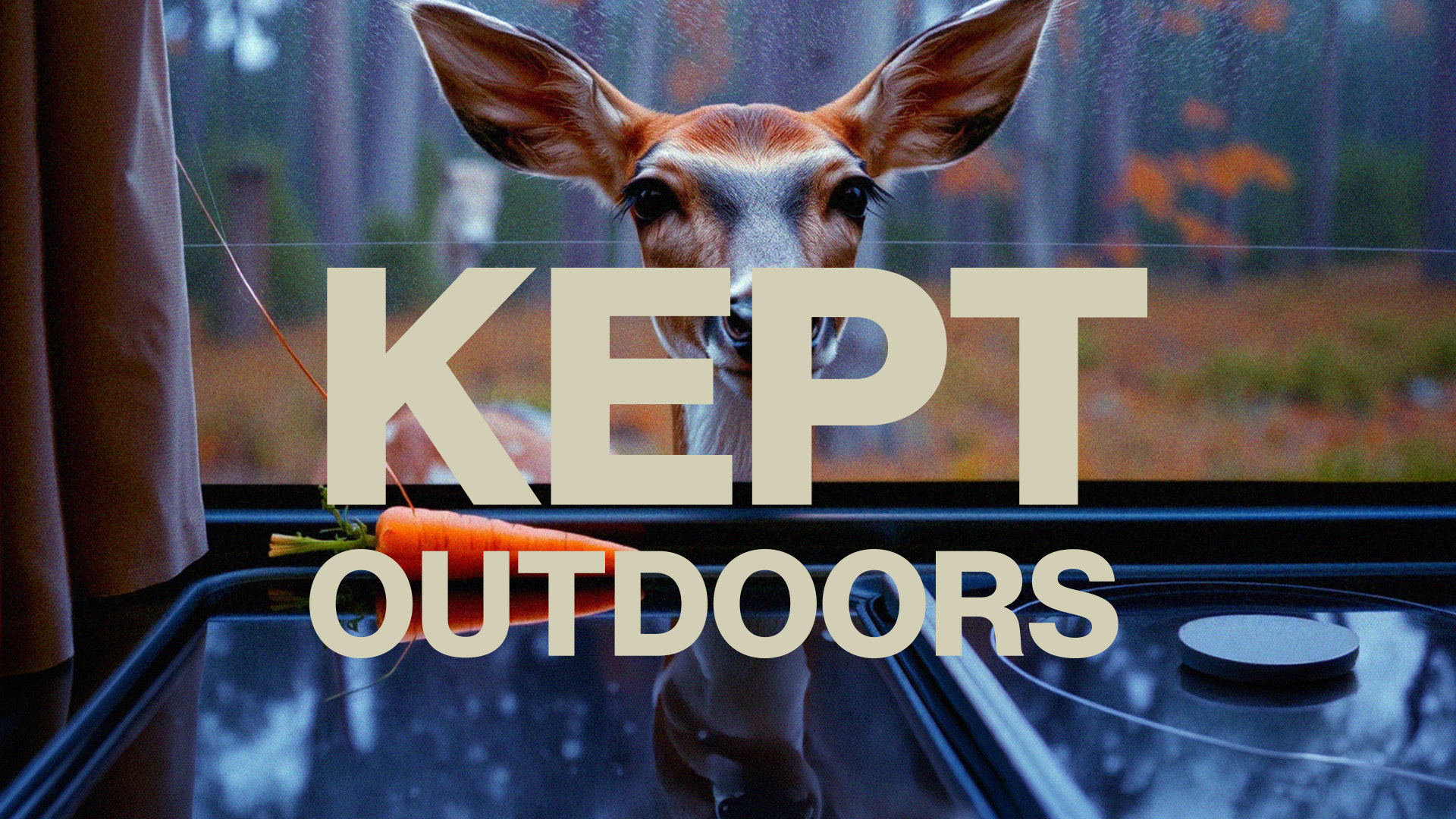
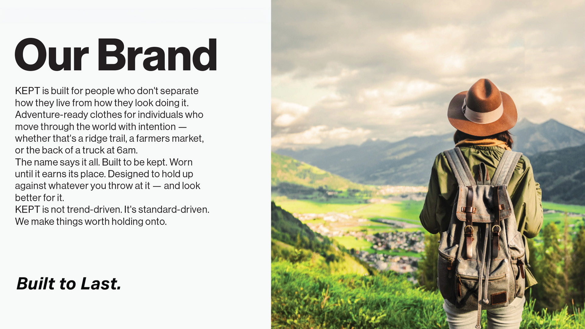
KEPT is built for people who don't separate how they live from how they look doing it. Adventure-ready clothes for individuals who move through the world with intention — whether that's a ridge trail, a farmers market, or the back of a truck at 6am.
The name says it all. Built to be kept. Worn until it earns its place. Designed to hold up against whatever you throw at it — and look better for it.
KEPT is not trend-driven. It's standard-driven. We make things worth holding onto.
Built to Last.
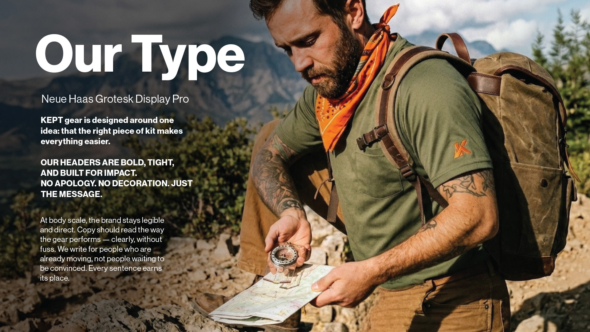
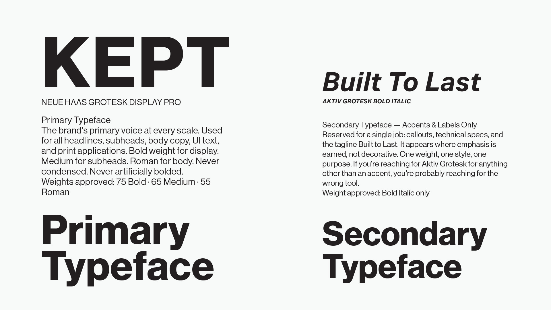
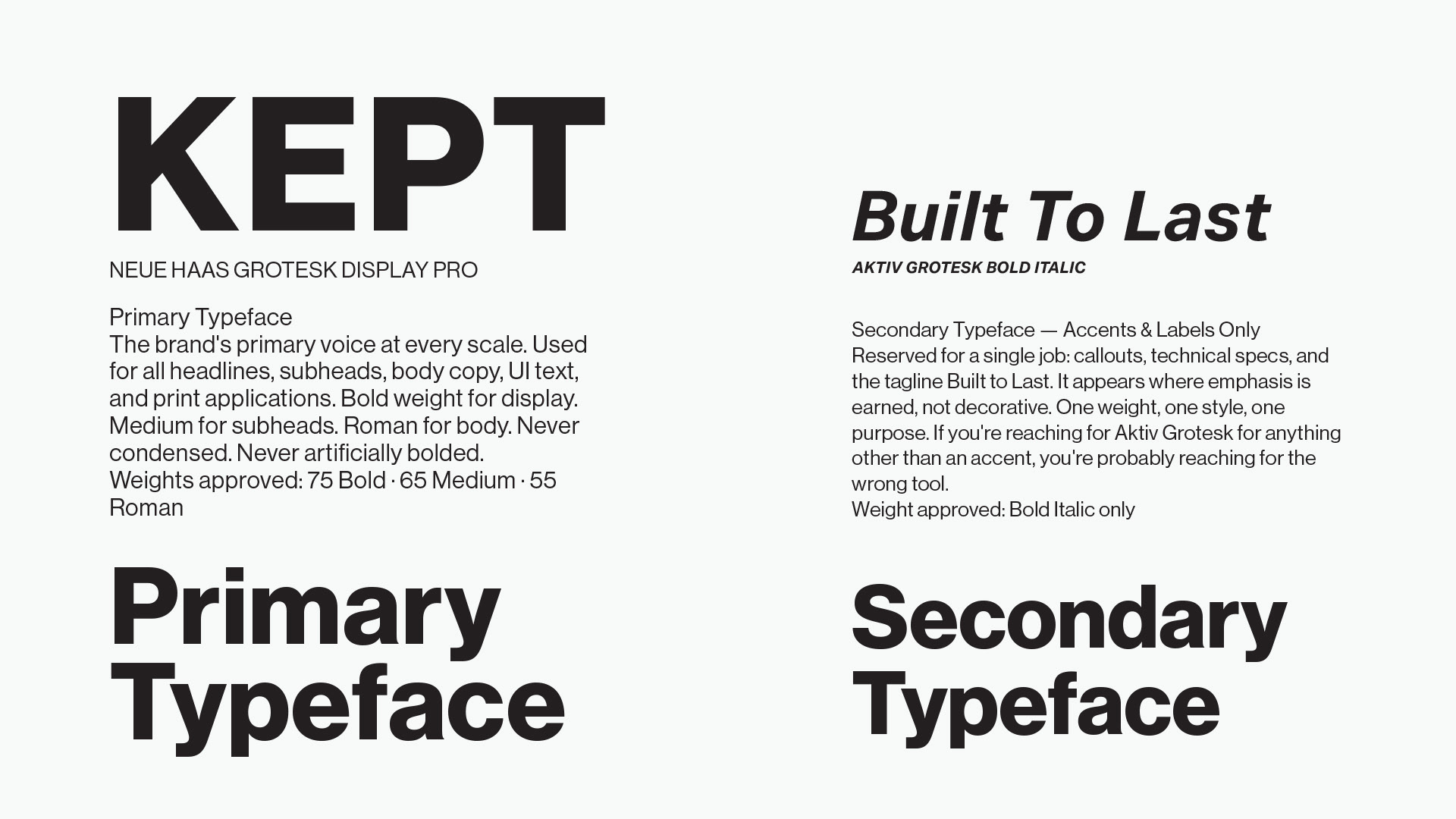
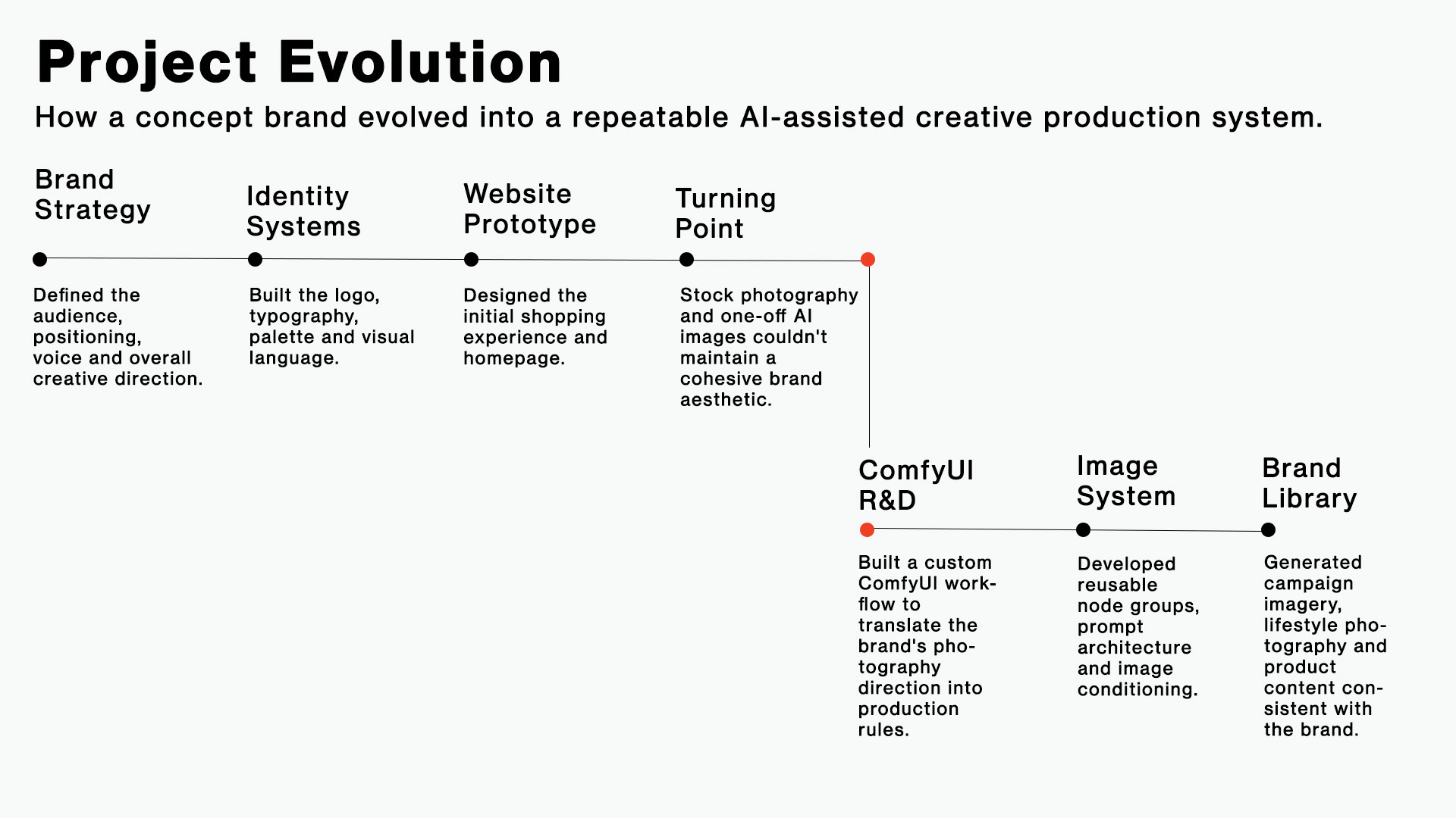
This project began as an experiment to answer a simple question:
Could a brand's photography direction become a repeatable AI production system?
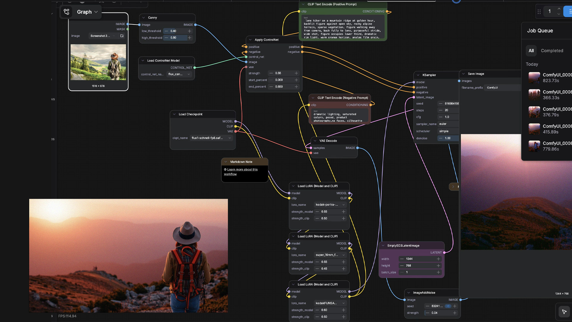
I spent months learning ComfyUI from the ground up—testing node graphs, ControlNet workflows, LoRA combinations, prompt architecture, and image conditioning—until I could consistently generate imagery that reflected the brand rather than the model. The result wasn't just a collection of images; it was a documented creative workflow that could scale a visual identity without sacrificing consistency.
Designing the Image System
That challenge led me deep into ComfyUI. Instead of treating AI as a prompt generator, I approached it like a creative production pipeline. I built a node-based workflow that translated KEPT's photography direction into repeatable generation parameters using ControlNet, custom prompt architecture, LoRA stacks, and image conditioning. The objective wasn't simply to generate attractive images. It was to create a system capable of producing an entire library of photography that felt native to the brand.